Replacing Explore Links Content Block
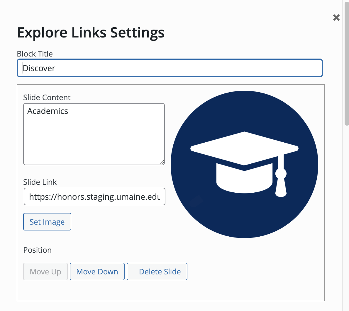
Many websites use the “Explore Links” Content Block. This is the block that creates circles from images or icons, and displays text underneath that you then link to other destinations.
Explore Links as a selection in the Content Blocks page editor:

The dialog box for Explore Links:
Replace this block with the Icons pattern “UM Blue Icon Set”
- Select the + icon in the upper left corner of the editor. The blue box will change to a black box with an X icon, and the block selection window will open
- Select the “Patterns” heading to display the list of patterns
- Select the “Icons” option to display the different patterns that use the icon circles
- Select “UM Blue Icon Set” and it will appear in the editor
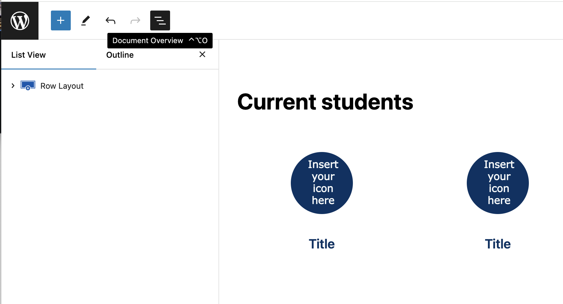
How to increase the number of icon links
The UM Blue Icon Set will create three placeholders for your links. Increasing the number of icons is straightforward.
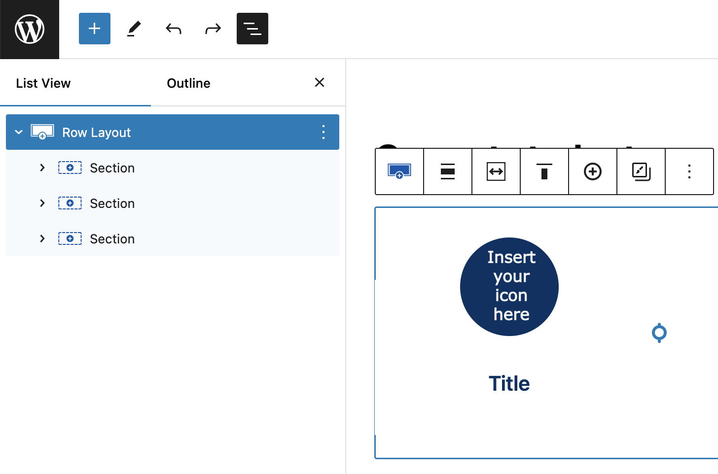
Select the Document Overview icon (fifth icon in upper left):
Expand the Row Layout by clicking the > symbol next to it:
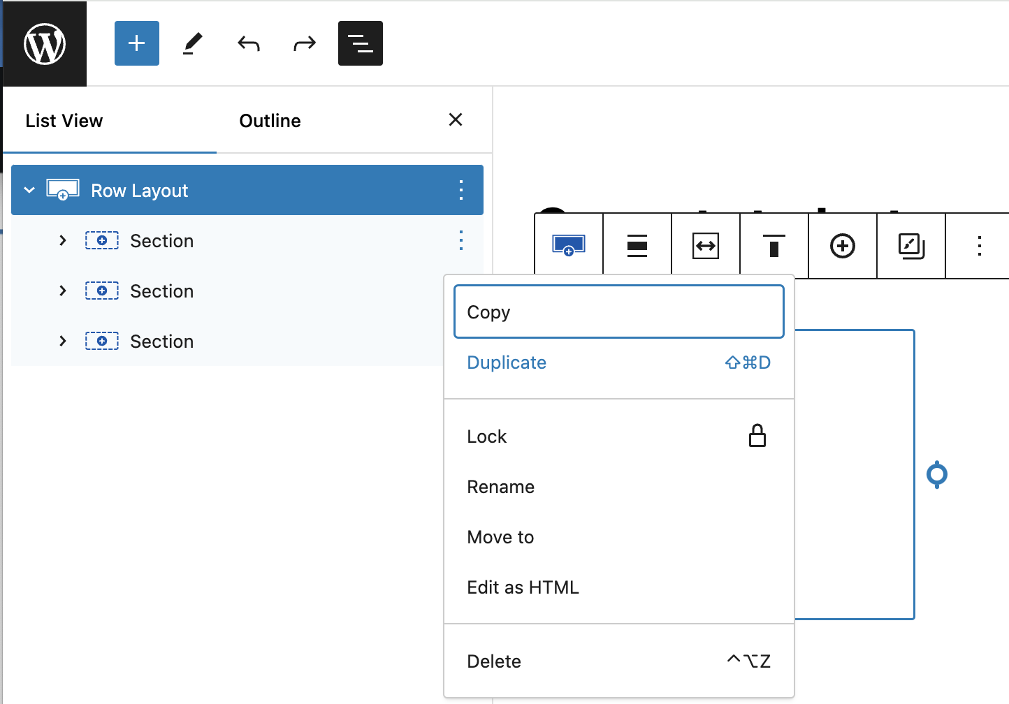
Highlight one of the “Section” items, either by clicking or hovering over with your cursor. A 3-dot “Kabob menu” icon appears to the right of the item. Click that to display a menu of options, and select “Duplicate” to make more copies of the section:
Duplicate the block until you have the number of icon blocks you need to replace your Explore Links block:
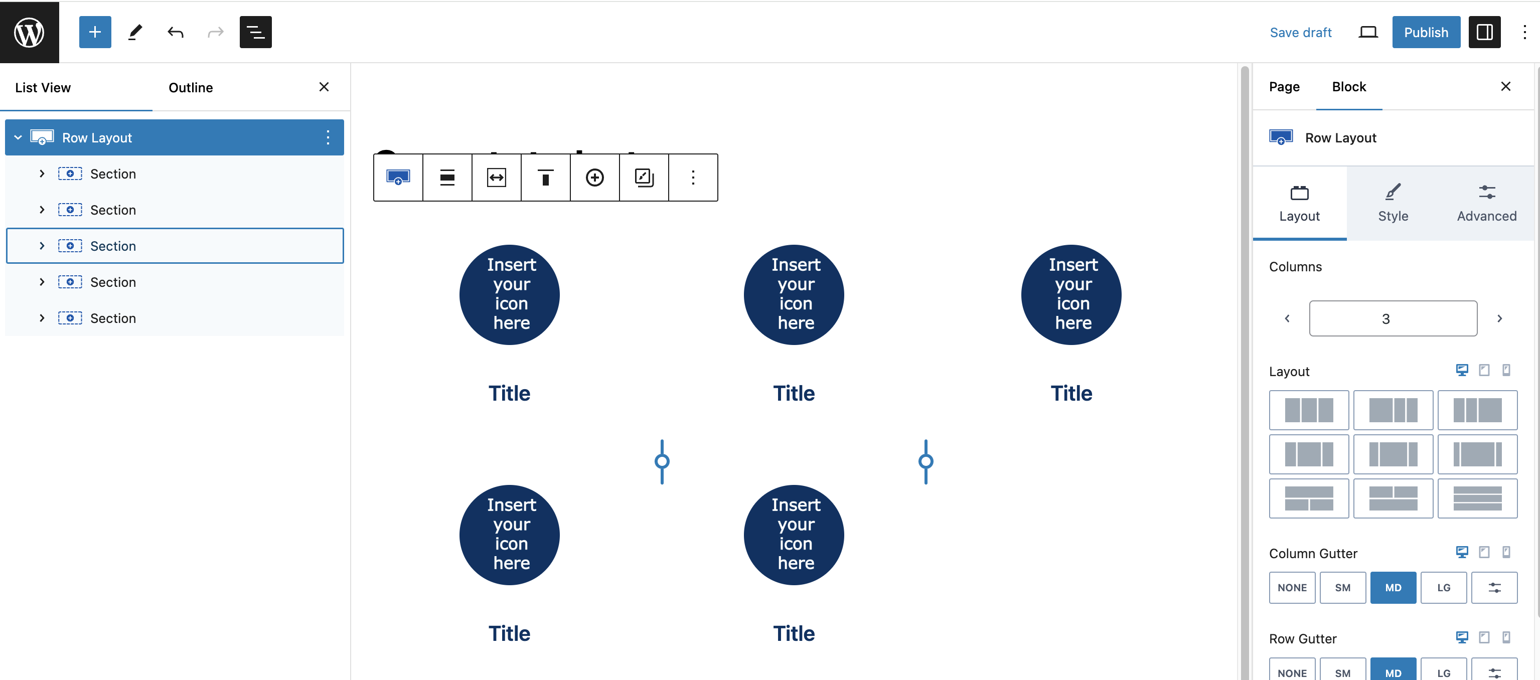
Setting the number of icons-per-row
By default the UM Blue Icon Set uses a Row Layout block set to three column display. You can easily adjust this within the Layout options for the Row Layout block. In this example we set this to 5 columns:
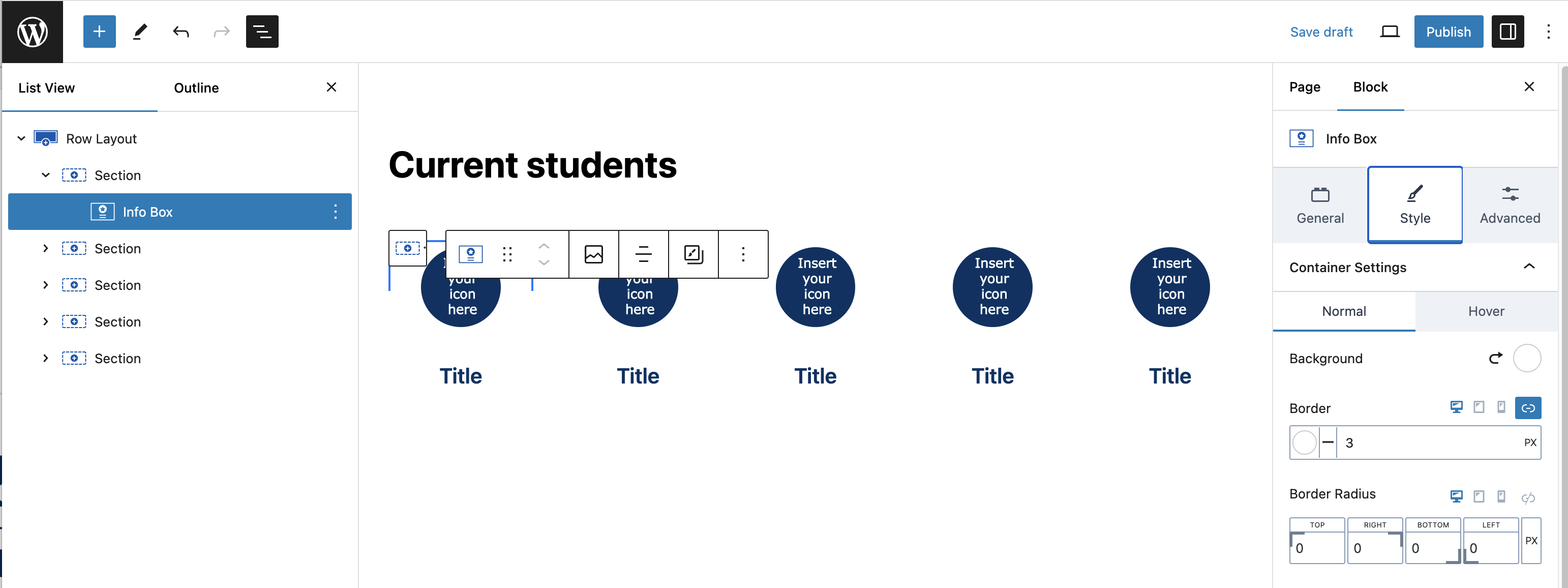
Select an image for a circle
The Icon Set pattern uses the “Info Box” block. Click on a circle’s “Insert your icon here” image, and select the Info Box “Style” tab (in the settings panel to the right) to replace the placeholder with an image:
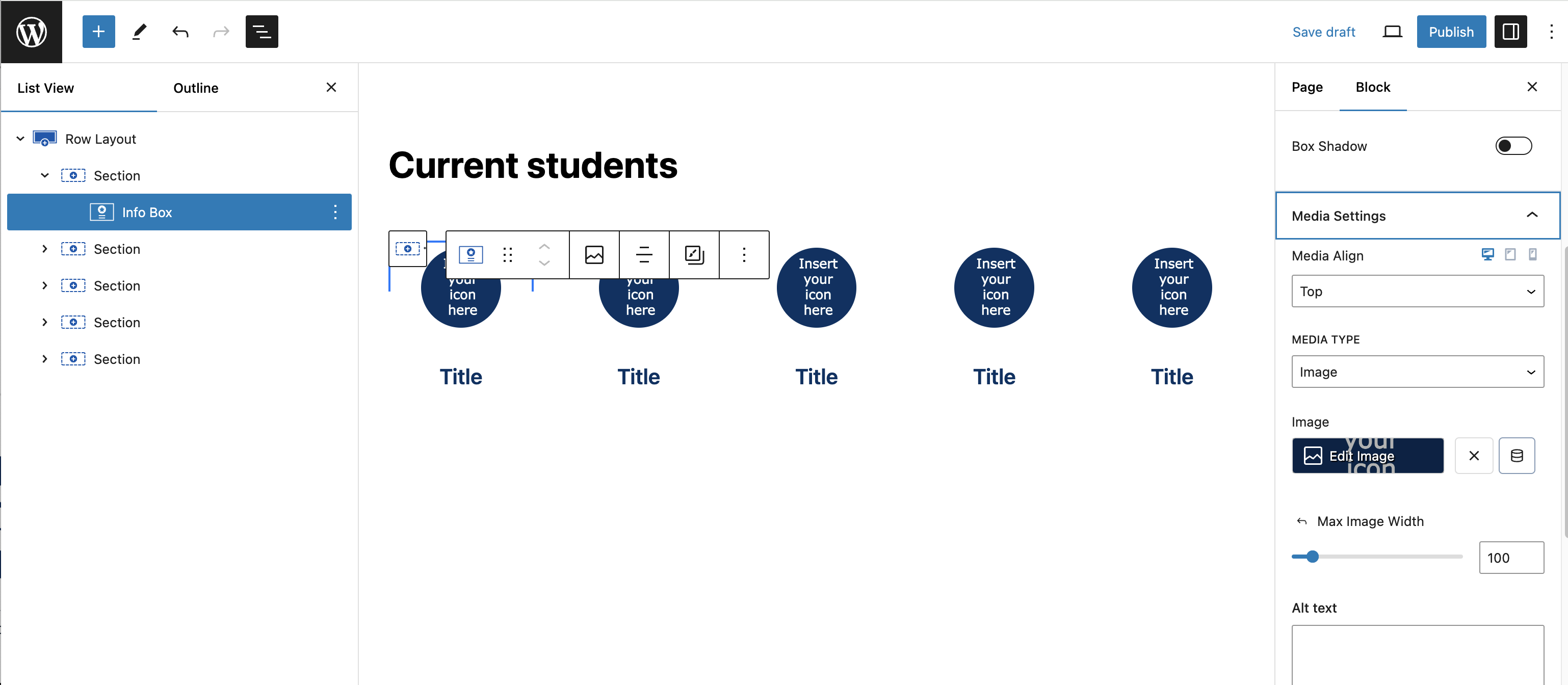
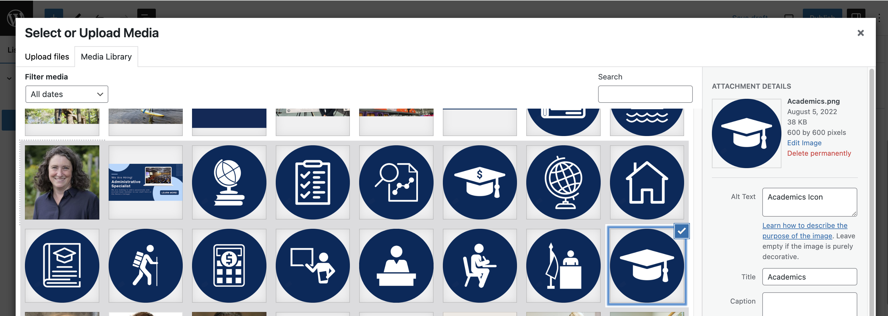
Click the “Edit Image” box to select the appropriate image from your media gallery. In this example, the image is of an icon:
The Info Box image works best when it is cropped to a square aspect ratio (1:1). Select this option from the Image Ratio drop-down (scroll further down in the settings panel to find this):
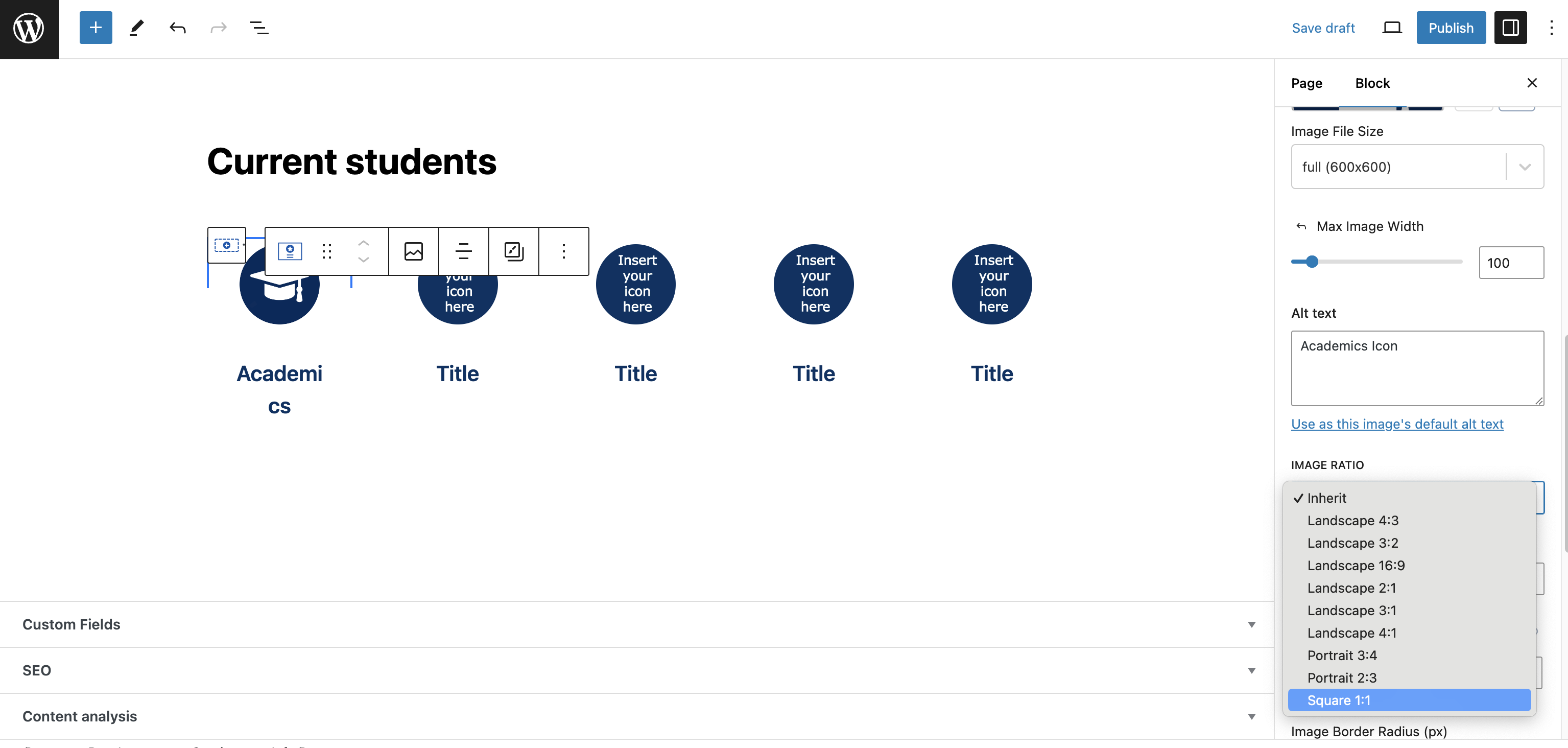
Setting the text and link
Update the text underneath the image by selecting the “Title” text and typing your new title.
The link for this info box is found in its General settings. Paste the web link in the link field, and click the “Submit” symbol to apply it: