Menu content block and mobile device display
The menu content block can be a handy page element to display a list of links in a button or list format, and is especially useful when that same set of links needs to be maintained across multiple pages.
There is a known display issue with the menu content block’s “Blue horizontal buttons” display option when viewed on a mobile device. While the menu’s blue buttons will become wide enough to accommodate a long button name, a button’s text may wrap to multiple lines when narrowed for a mobile device. Below are two examples of a menu using this feature to illustrate the issue:
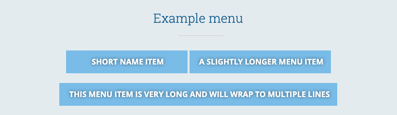
Above is an example of a menu block with button names of various widths. As you can see, the third button is much wider than the first two, accommodating the much longer button text.
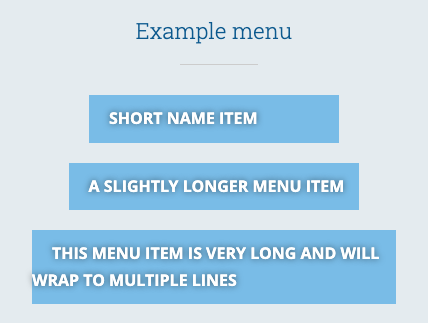
On a mobile device’s narrower screen, the third button’s text shifts to two lines, and the second line display is left-aligned, not centered.
Workarounds to this known issue
Option 1: Shorter button names
In the menu editor, you can override the page or custom link name with shorter text, which is typically a good idea for navigation menus in general. This option should be used if the menu is displayed on multiple pages.
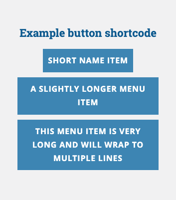
Option 2: Button shortcode
The button shortcode does not have this same display issue, as shown in the image below. This option should be used if the menu is displayed on a single page, or if it is unlikely you will need to manage the buttons on multiple pages.