Accessibility and tables
Web accessibility has always been a requirement for UMaine websites, and Digital Communications has been increasing efforts to improve the accessibility of web content on umaine.edu. The term “accessibility” refers to our efforts to remove barriers that prevent access to websites by people who have a disability. This month, we explain how to address accessibility in tables.
Do not use tables for layout
Before we detail how to create an accessible table, it’s important to note that tables should be used sparingly on a website. For layout needs such as columns of text, it is more appropriate to use content blocks on the page instead of tables.
When to use tables
Tables should be used when it’s necessary to present information in a grid, where columns and/or rows have a consistent topic or meaning. These tables can be added to a page using this button in the text editor toolbar:

This tool works much the same as it does in Google Docs or Microsoft Word, offering a visual grid for selecting the number of rows and columns.
Identify row and column headers
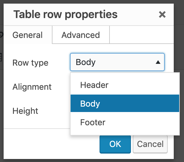
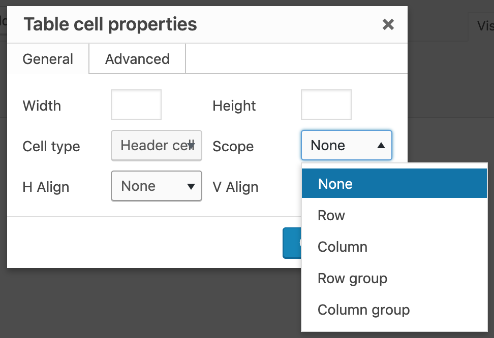
 To help readers understand the information in your table, headers are required, and those need to be properly identified as headers. Once your table is created, put your cursor in a cell that you want to designate as a header, and select either the “Cell” or “Row” option in the table drop-down menu. Both of these sub-menus will have a “properties” option you can set (example at right).
Note: If your table has headers at the top of columns, all in a single row, select “Table row properties.” If your table’s headers are at the left or right of rows, all in a single column, you must individually set each cell in that column to be a header by choosing “Table cell properties.”
Designate the scope of the table headers
The “scope” setting identifies whether a table header is a column header or a row header. It tells the screen reader what is associated with the table header:
- Select “Row” for a header when it applies to all the cells in that row
- Select “Column” for a header when it applies to all the cells in that column
- Select “Row group” or “Column group” in advanced situations where you have headers that span multiple columns or rows.

Pay attention to mobile view
If your table needs to be as wide as your web page when viewed on your desktop, it will likely be a poor experience for someone viewing the table on a mobile device. To check for this, simply reduce the width of your web browser window to a narrow width. You will notice that the website header and footer change layout to accommodate the smaller screens of mobile devices. If your table cannot also narrow to that same width, any content that falls over the right margin will be unavailable. When this happens, consider presenting your content without using a table. An alternative to a table would be a series of bulleted lists, with each table row presented as its own set of bullets (where each bulleted item would have appeared in a column of the table).
If you find yourself struggling to make your table both accessible and usable on a mobile device, please contact us— we are here to help.
