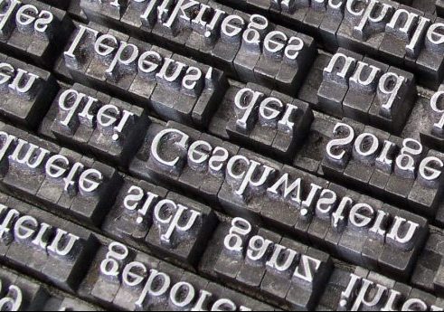
Fonts Can Speak Louder Than Words
In an ideal world, we’d be guaranteed that academia could exist without the influence of any type of bias and that merit alone would be the basis of evaluation. It’s an unfortunate reality that bias does exist. (Articles like this one from The Chronicle have delved deeper into the debate surrounding the notion of unconscious bias and its impact on behavior.) Now that we’re a few weeks into the semester, let’s take a look at a different kind of bias that can impact the way that we as instructors evaluate student work.
This particular bias is not about instructors playing favorites or working diligently to design assessments that counter gender bias (though those are both issues worth discussing at another time). Rather, this bias is connected to a decision as basic and modest as any you might imagine – the font a student chooses for their paper.
It’s true. Something as simple as the font a writer uses can have repercussions on how their work is received by the reader. And sure, a paper submitted in Comic Sans probably doesn’t hold the academic weight of one in Times New Roman, but the differences can be much more subtle and still have an impact on the reader’s perception.
Curious yet? Errol Morris conducted a study in the New York Times on the effect a typeface has on the believability of a passage of text. In this article that ran as a follow up to Morris’s study, Hear, All Ye People; Hearken, O Earth, there’s a connection to how changes in fonts actually resulted in different grades. Check that out here: The Secret Life of Fonts.
In essence, words matter, but so too do the very shapes of the letters we choose to put on the paper. We should keep this in mind the next time we’re evaluating someone else’s work; of course, it’s also worth considering for our own. There’s a reason why Errol Morris now writes all his manuscripts in Baskerville, after all. Perhaps that would be a useful trick the next time we submit something for peer review.
