The Art of Climate Science
Jill Pelto
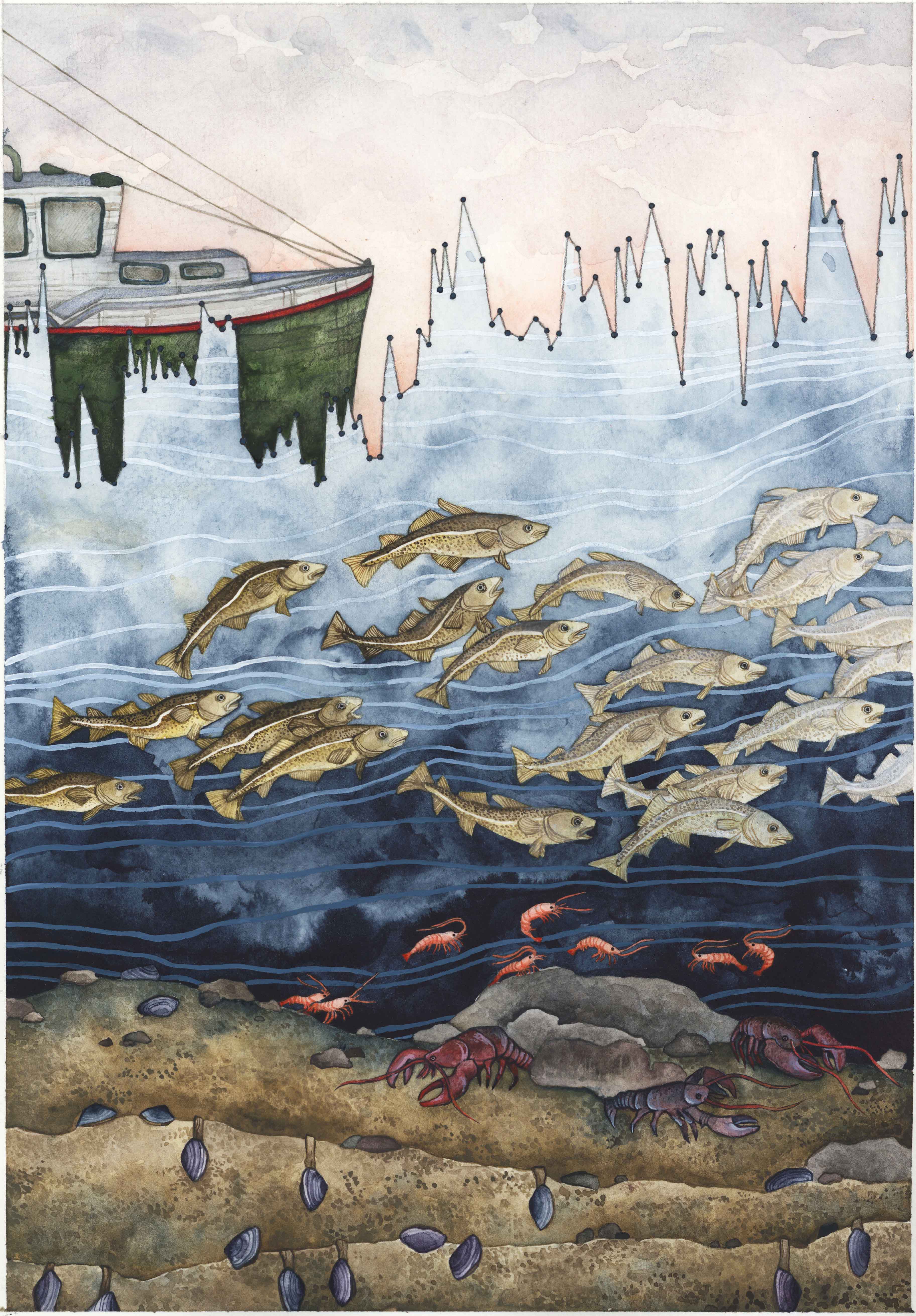
Gulf of Maine Temperature Variability
(Watercolor, 2018)
Gulf of Maine Temperature Variability tells the story of increasing temperature fluctuations in Maine’s coastal marine environment. The watercolor uses ocean temperature data from the past 15 years to highlight how greater variability affects various species including ourselves. The piece also highlights the inattention to the coupled relationship between human action and environmental responses that has contributed to depleted fish stocks and increased ocean acidification. This Gulf of Maine story spans the water column: from the burrowing clams and bottom-dwelling lobster and shrimp, to the overfished cod which disappear across the painting as they struggle to return to a changing habitat, and finally up to the surface where fishers and managers may adopt sustainable practices or continue the practices that have resulted in overfishing and by-catch. Each species has a complex interaction with the environment, and if the imbalance of our give-and-take relationship with the ocean persists, we will continue to see new stresses that irreversibly change ocean conditions within the intertidal mudflats and into the yet unexplored ocean depths.
Data Source:
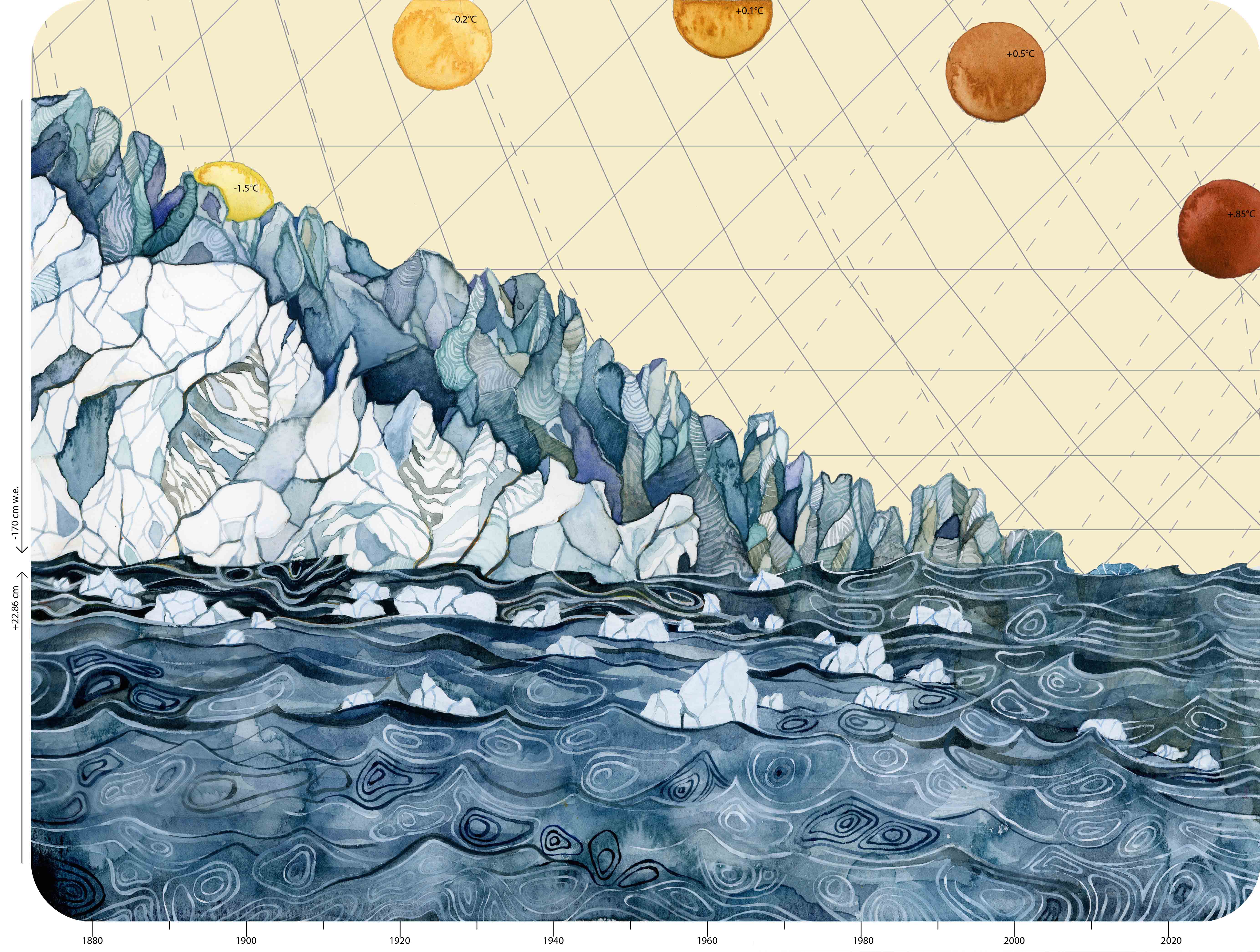
Climate Change Data
(Watercolor, 2015)
Climate Change Data depicts multiple datasets: the annual decrease in global glacier mass balance, global sea level rise, and global temperature increase. I wanted to convey in an image how all of this data must be compared and linked together to figure out the fluctuations in Earth’s natural history. One of the reasons scientists study what happened in the past is to understand what may happen now as a result of human-induced climate change. I represented this by illustrating that glaciers are melting and calving, sea levels are rising, and temperatures are increasing. The numbers on the left y-axis indicate quantities of glacial melt and sea level rise, and the suns across the horizon contain numbers that represent the global increase in temperature, coinciding with the timeline on the lower x-axis.
Data Sources:
- Climate Change Indicators – Sea Level Rise
- Disastrous Year for North Cascade Glacier Mass Balance
- NOAA/NASA Annual Global Analysis for 2015
- Rate of Climate Change to Soar by 2020s
- Causes of Sea Level Rise: What the Science Tells Us
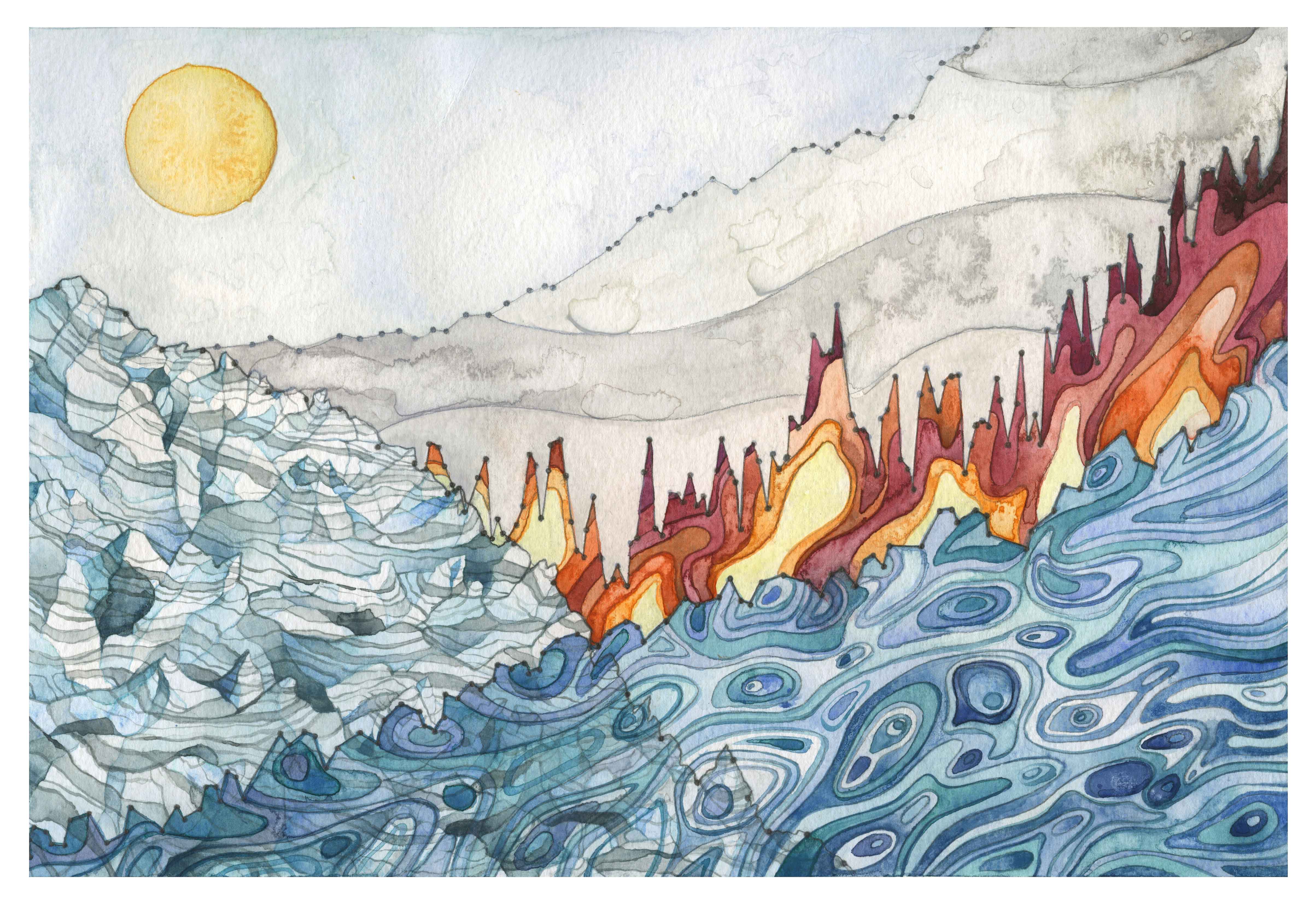
Landscape of Change
(Watercolor, 2015)
Landscape of Change uses data about sea level rise, glacier volume decline, increasing global temperatures, and the increasing use of fossil fuels. These data lines compose a landscape shaped by the changing climate, a world in which we are now living.
Data Sources:
- Climate Change Indicators – Sea Level Rise
- Disastrous Year for North Cascade Glacier Mass Balance
- NOAA/NASA Annual Global Analysis for 2015
- Is Antarctica Gaining or Losing Ice?
- Fossil Fuels Remain Dominant through 2040
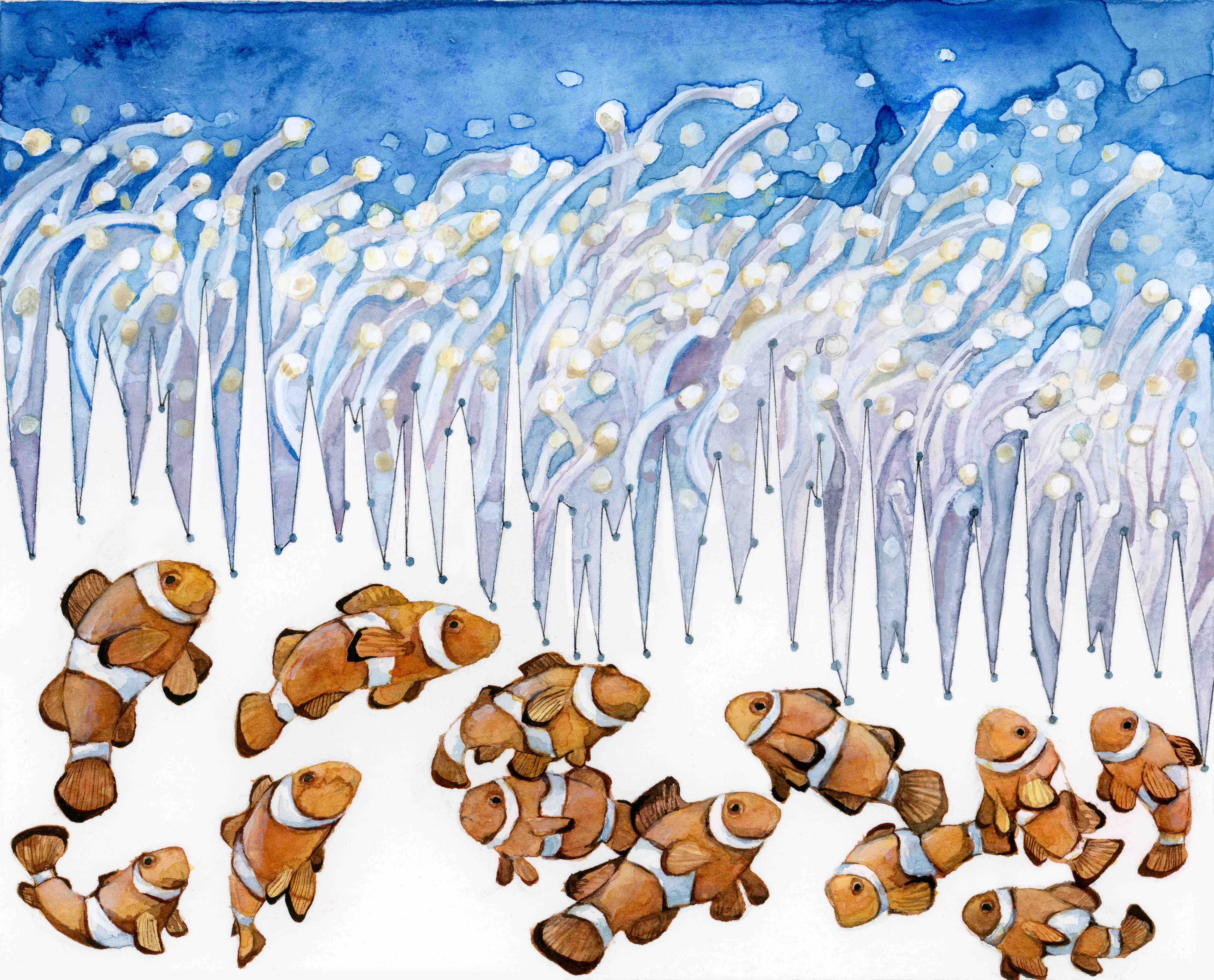
Habitat Degradation: Ocean Acidification
(Watercolor, 2015)
Habitat Degradation: Ocean Acidification contains ocean pH data from 1998 to 2012. The decreasing pH is due to atmospheric carbon dissolving into the ocean and creating carbonic acid. This has harmful effects on many marine organisms. Studies on clownfish show that more acidic water alters how their brains’ process information. This affects their ability to avoid predators by detecting noises and their ability to find their way home. The clownfish in this watercolor are grouped in confusion, separated from the anemone in which they live.
Data sources:
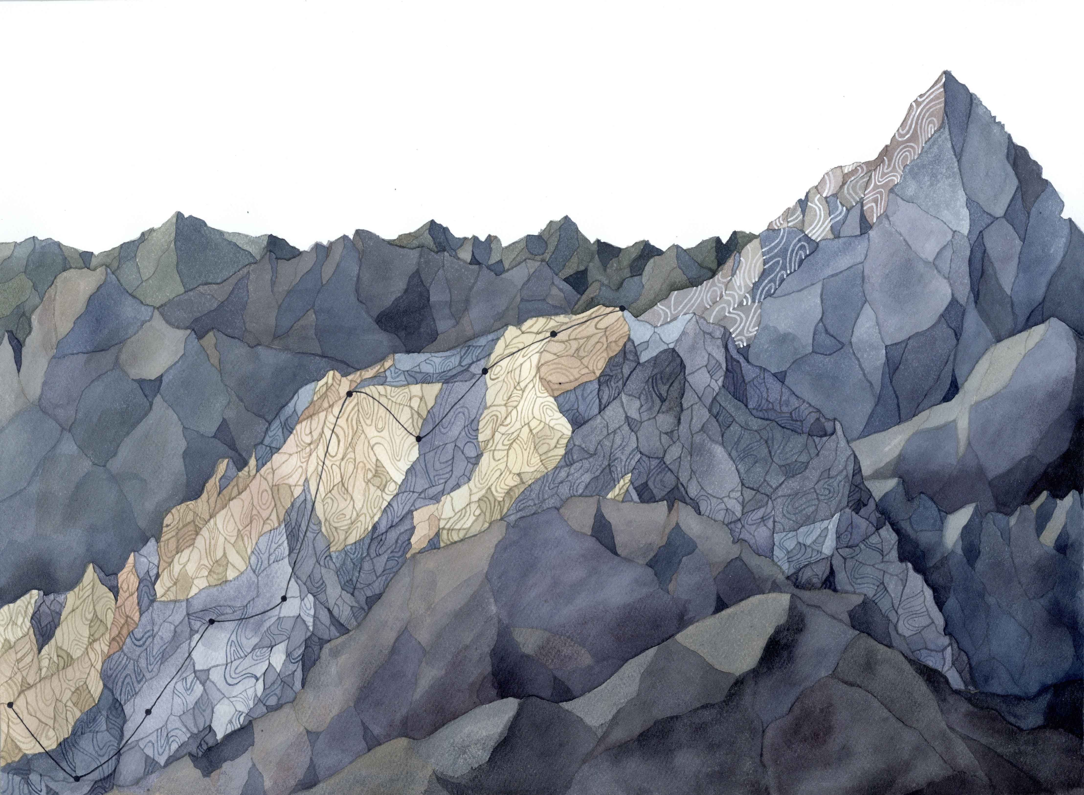
Progression
(Watercolor, 2016)
Progression uses data showing the increase in overall use of renewable energy by the United States over the last decade. As a country we are working towards a goal, but we still have a long ways to climb.
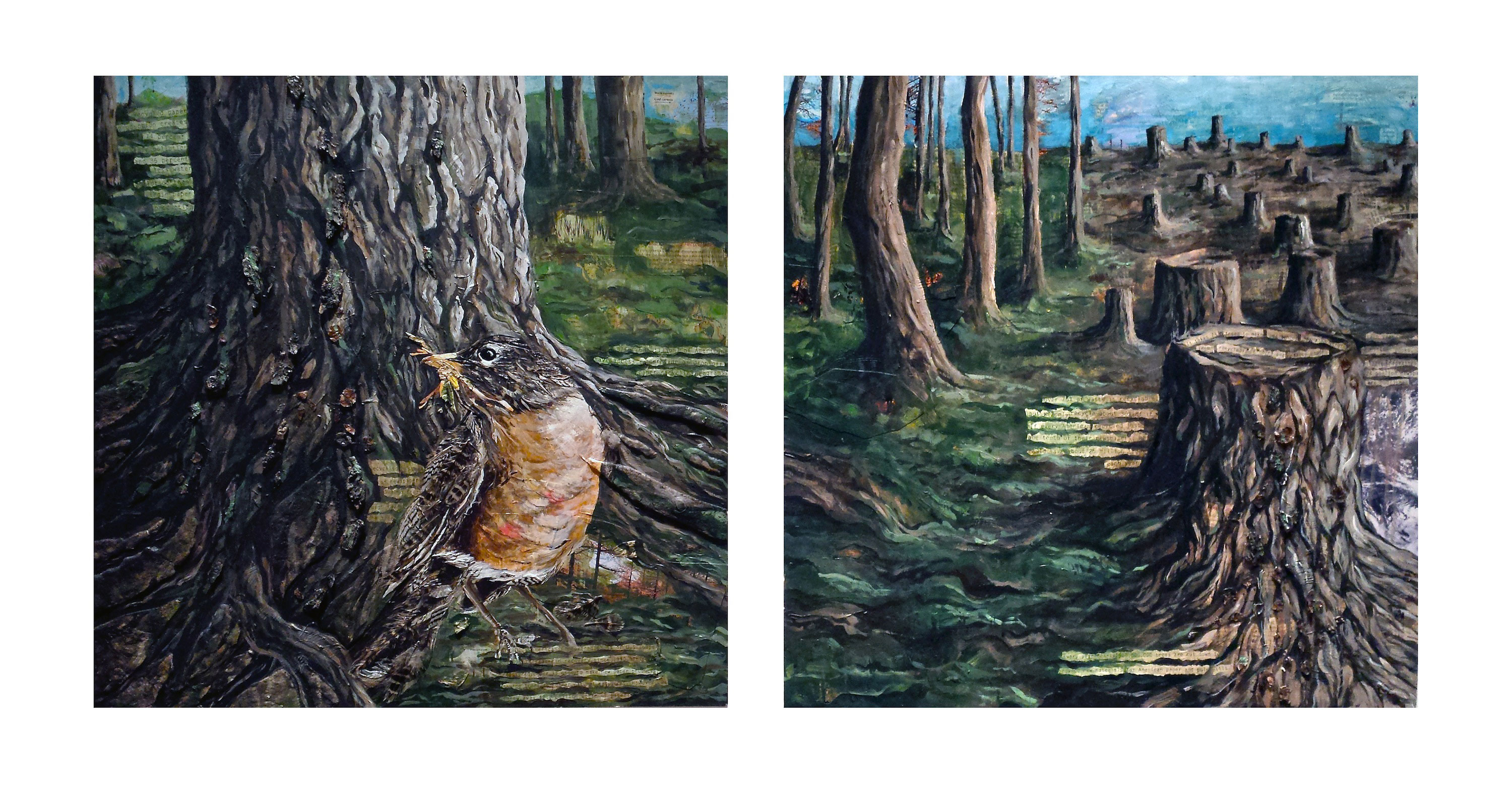
Take a Lesson from Nature: Recycle
Take a Lesson from Nature is about the importance of recycling. The piece is a collage of recycled materials including newspapers, magazines, and found natural materials such as bark, leaves, and feathers. The message is that humans should take a lesson from the natural cycles in our world and have sustainable lifestyles and societies.
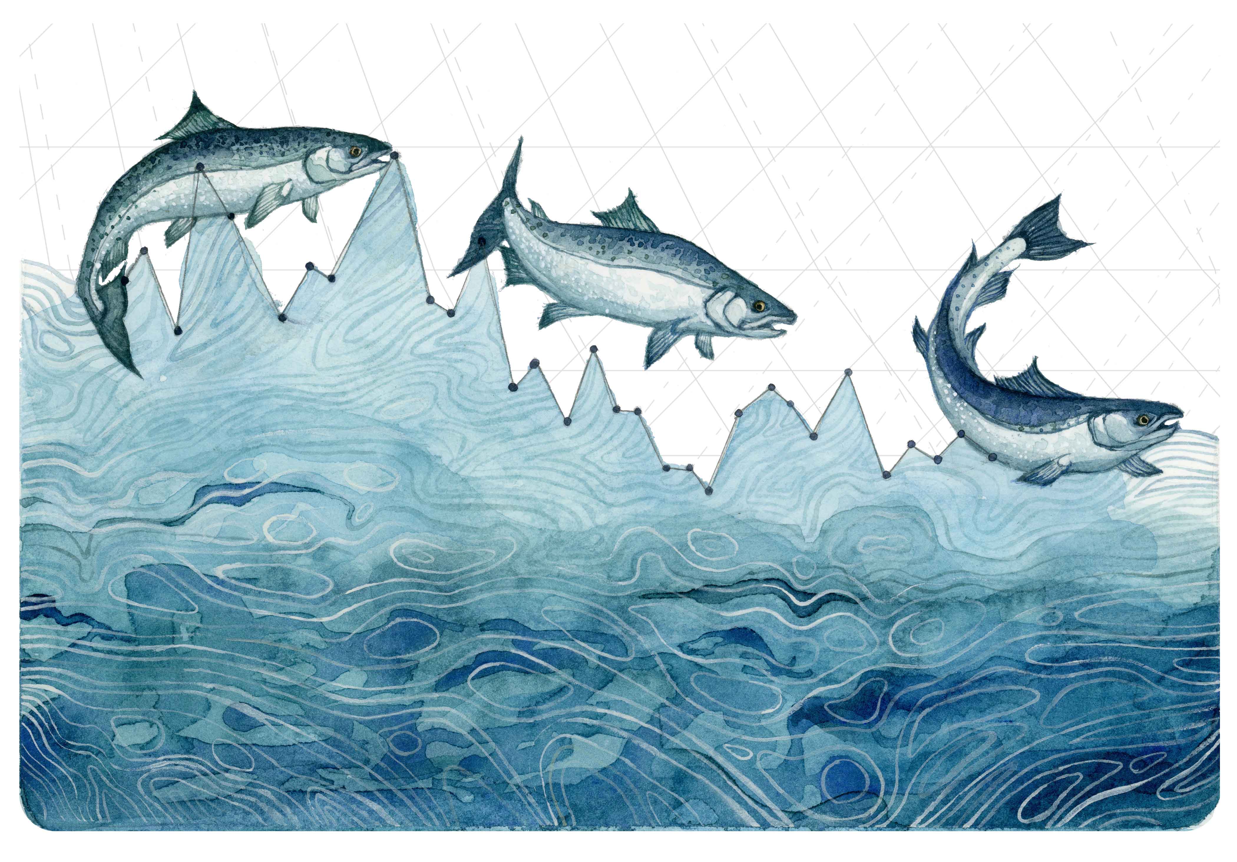
Salmon Population Decline
(Watercolor, 2015)
Salmon Population Decline uses population data about the Coho Salmon in Washington. Years with drought and low snowpack in the mountains greatly deplete the state’s hydrosphere. Consequently, the water level in the the salmon spawning rivers becomes very low, and the water is too warm for the salmon to thrive. In this piece, the salmon are depicted swimming along the length of the graph, following its current. While salmon can swim upstream, it is becoming more difficult with lower stream flow and higher temperatures. This image depicts the struggle their population is facing as their spawning habitat declines.
Data source:
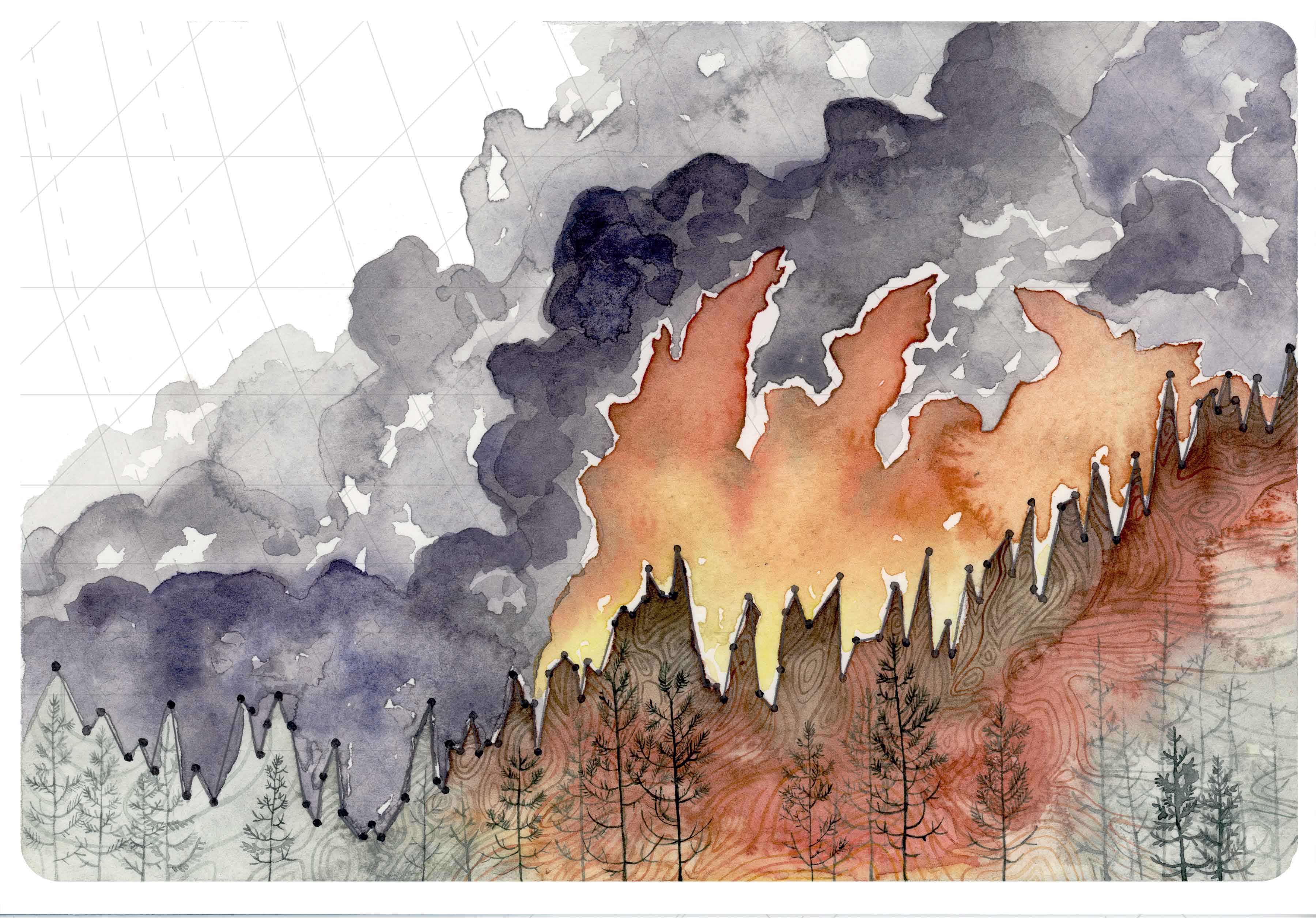
Increasing Forest Fire Activity
(Watercolor, 2015)
Increasing Forest Fire Activity uses global temperature data. This piece is inspired by two weeks I spent in Washington in August 2015. Massive forest fires raged throughout my stay, greeting me with many smoke-filled days. As global temperatures rise and drought and drier than average conditions persist, forest fires will become a huge threat to the forest, plants, and animals—and of course to people and structures.
Data Source:
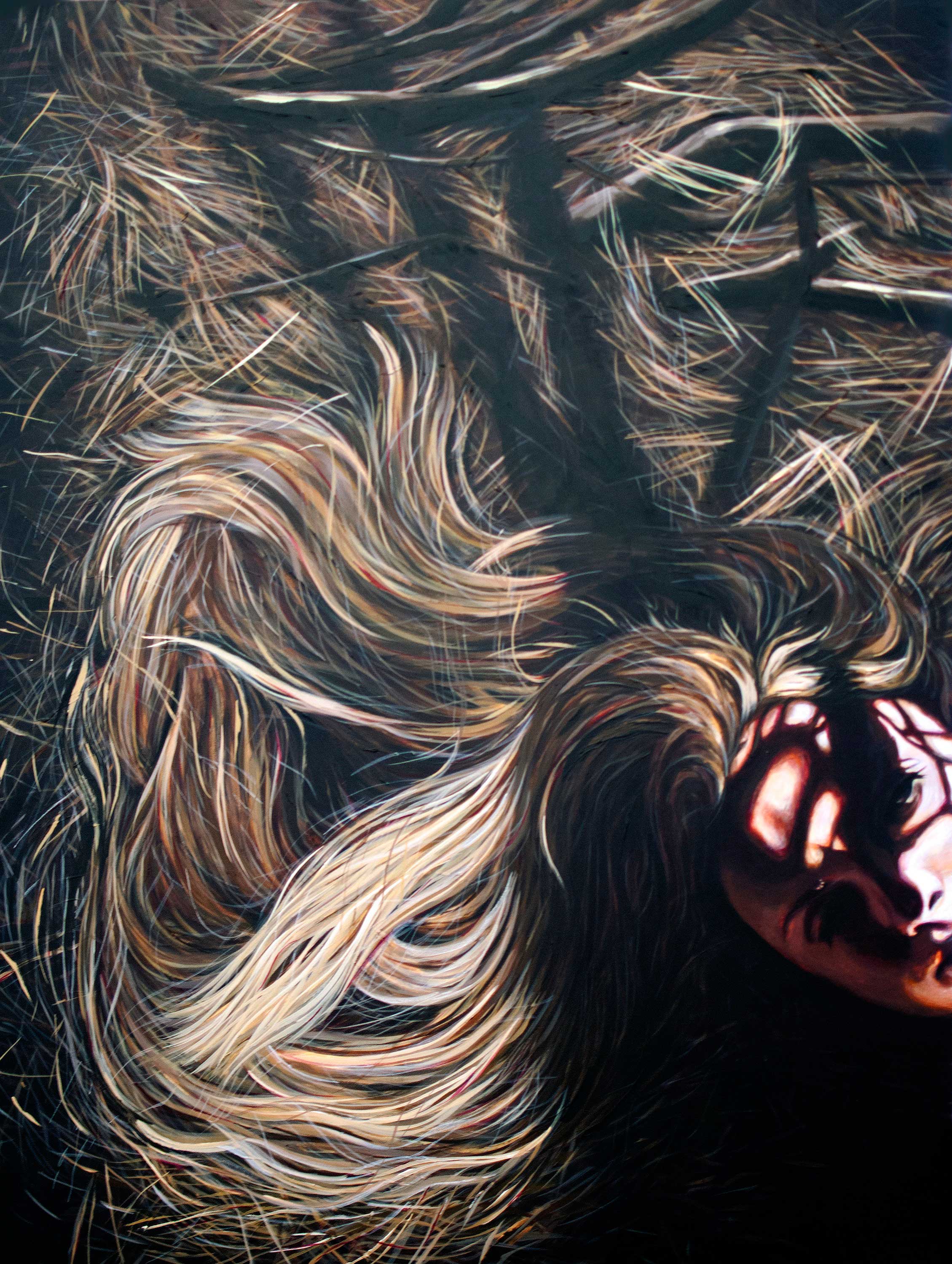
One and the Same
(Acrylic, 2014)
This piece is a self-reflection on my relationship with nature, and how taking the time to foster that connection can define my thoughts and actions.
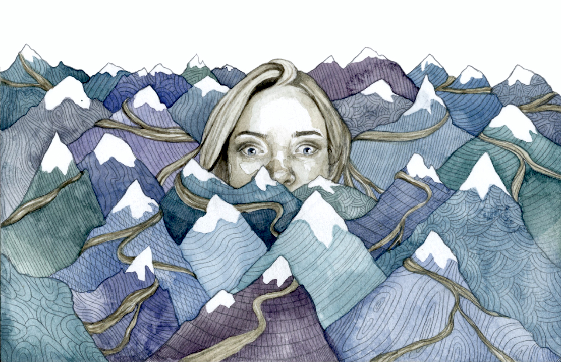
Perspective
(Watercolor, 2014)
This painting is about the exciting and overwhelming choices we all have to make as young adults, and certainly as college students. But it’s a reminder that there are many possible paths to happiness.
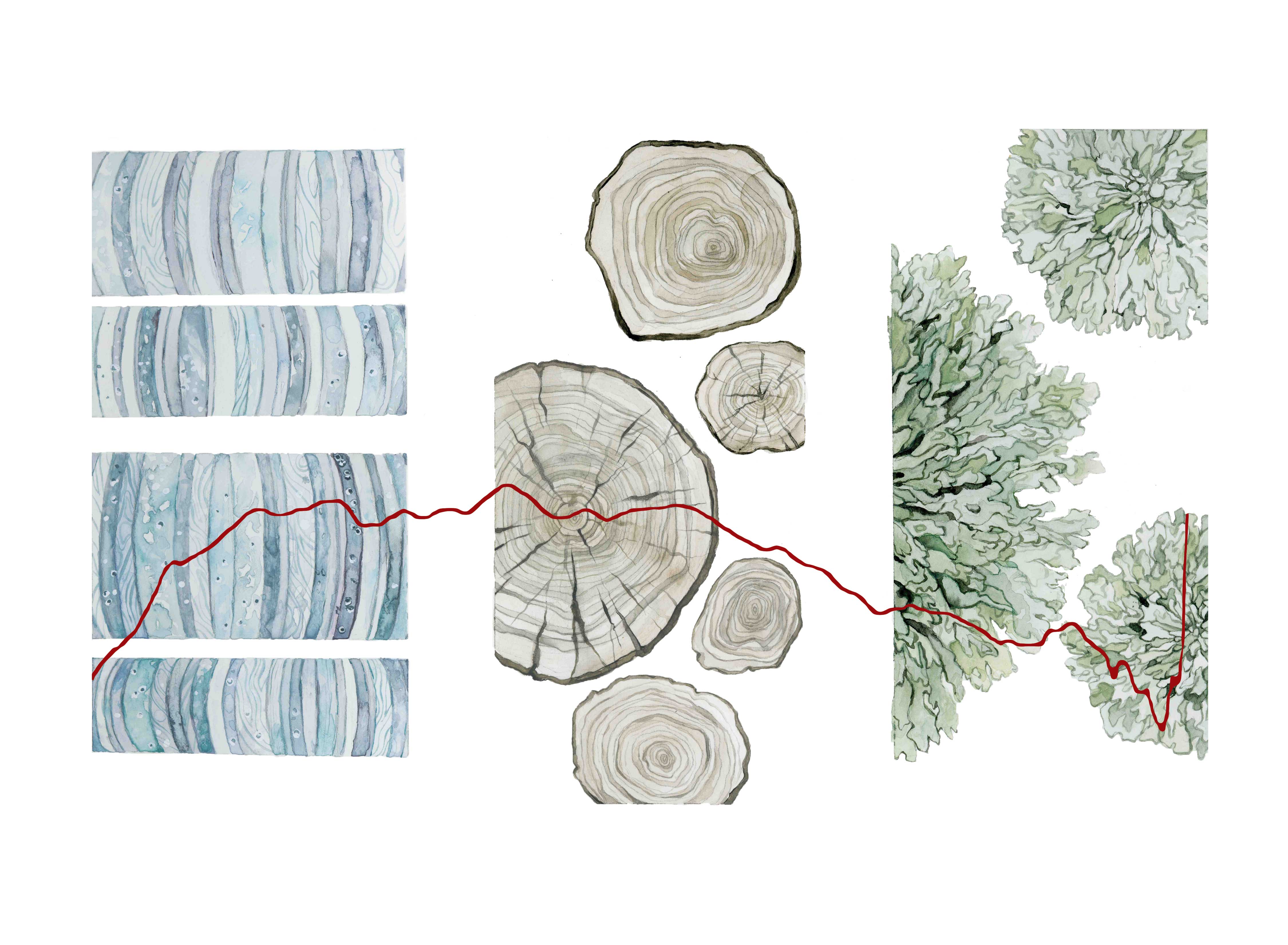
Proxies for the Past
(Watercolor, 2015)
Proxies for the Past is inspired by the universal unknowns, which humans try to solve by using materials such as ice cores, tree rings, and lichens to date past climate events. Nature reveals some of its secrets in these concentric forms, allowing us to determine information such as the average global temperature of Earth from 11,000 years ago to present. The piece is an interpretation of this data. Thus, natural materials help us to understand a small portion of Earth’s history.
Data Source:
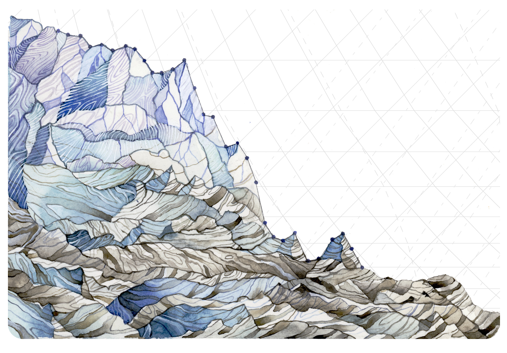
Decline in Glacier Mass Balance
(Watercolor, 2015)
Decrease in Glacier Mass Balance uses measurements from 1980-2014 of the average mass balance for a group of North Cascade, Washington glaciers. Mass balance is the annual budget for the glaciers: total snow accumulation minus total snow ablation. The mass balances of these glaciers are consistently negative, and glacier mass loss is accelerating.
Data Source:

