Replacing Separator Content Block
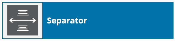
The “Separator” Content Block is one of our simplest blocks, and offers a boundary between other content blocks.
Separator as a selection in the Content Blocks page editor:
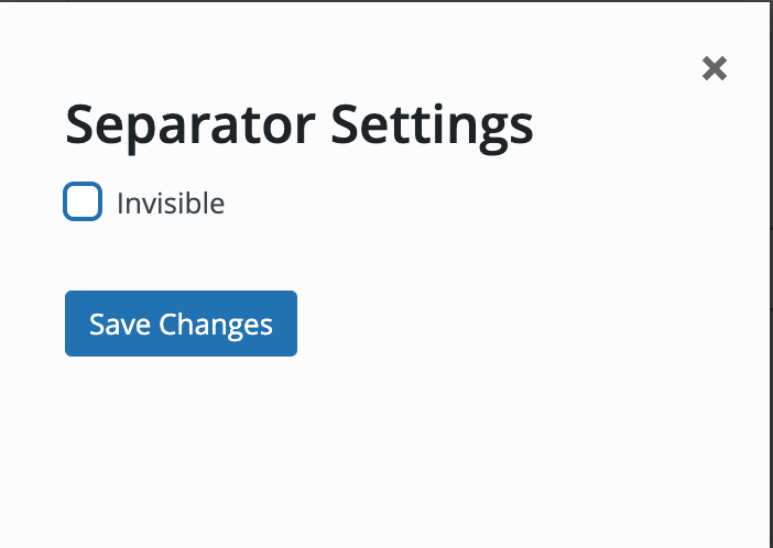
The dialog box for Separator:
Replace this block with the “Spacer/divider” block
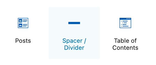
- Select the + icon in the upper left corner of the editor. The blue box will change to a black box with an X icon, and the block selection window will open
- The “Blocks” heading displays the list of blocks available
- Type “spacer” in the search box or select it from the full list
Spacer/Divider block options
By default the spacer will span the full width of the content area, and has a 60 pixel height. Similar to the old Separator block, the Spacer/Divider block can be made invisible by toggling the “enable divider” off in divider settings.
Divider settings offer many display options:
- Divider style (solid, dashed, dotted, stripe)
- Divider color (light grey by default)
These divider options can be set separately for desktop, mobile, and tablet displays:
- Alignment (left, center, right)
- Divider height
- Divider width
Finally, the Spacer/Divider advanced options allow it to be shown or hidden altogether for desktop, mobile, and tablet displays.