Alt Text for images
Alt text is an alternative description for an image on your website. Visitors who rely on assistive technology such as screen readers cannot see these images. When the page is read aloud the image will be denoted as “image” in the audio. Without alt text, the visitor misses out on the information that you intended to convey with an image.
The most frequent visitor to your website that relies on alt text is likely Google and other search engines. Search engines do not see with eyes, and so they rely on the non-visual content of your web page in order to characterize it for search. Because of this, proper alt text on images is helpful both to your visitors and your website’s appearance in search (especially Google Images).
How to Access Patterns
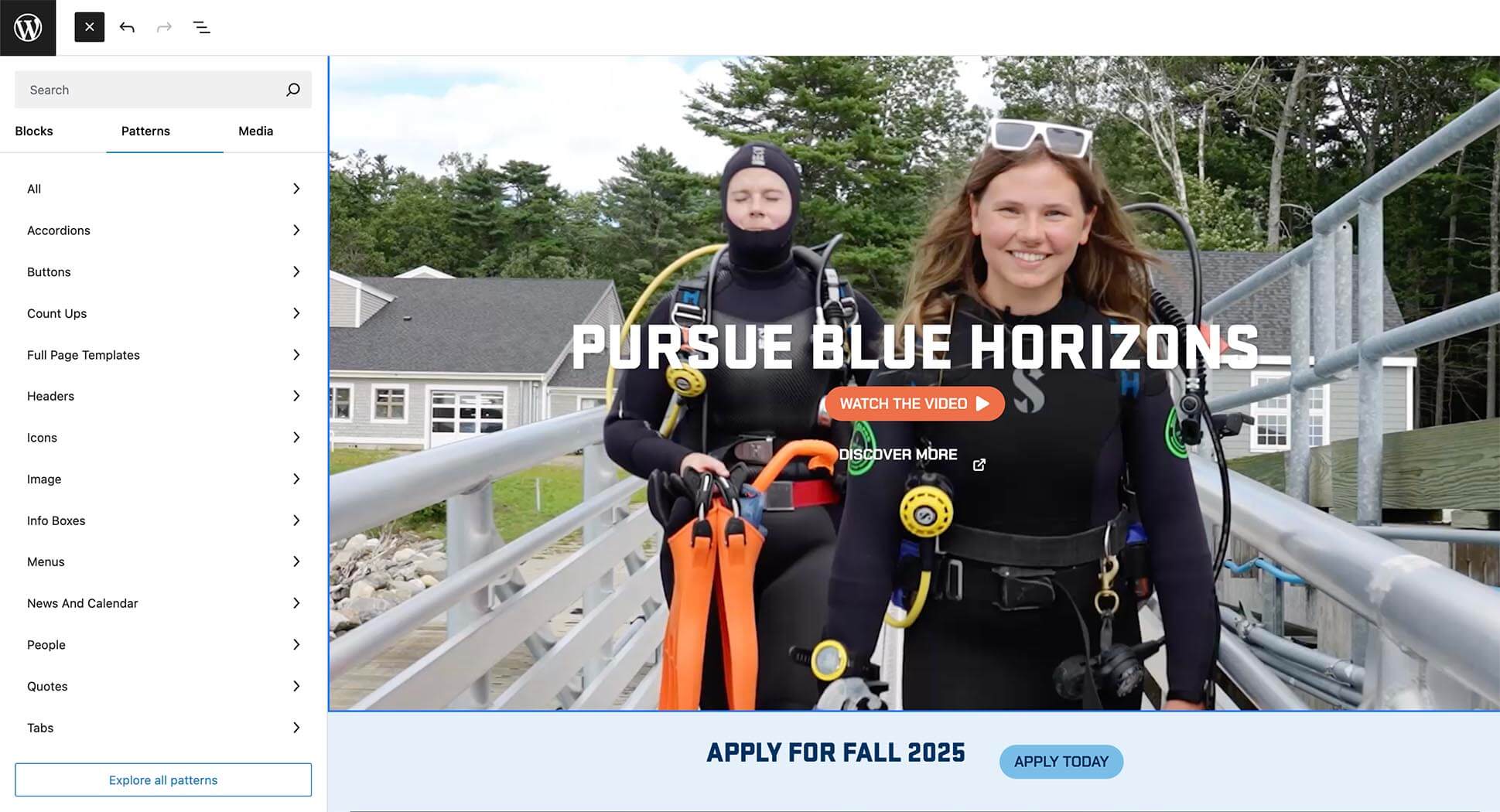
Starting from scratch? Instead of selecting a plain WordPress block, click the second tab on the top to find Patterns. Patterns are branded blocks that UMaine Marketing has made for you that already include approved colors, fonts, styles and layouts. These patterns should help make webpage design a breeze!
Colors
Below are the primary web colors being used in new website designs.
Dark Blue
#082E58
Headlines, buttons (hover state), section backgrounds (solid and gradient), body text
Medium Blue
#4176A1
Use only with dark blue in background gradients (DO NOT USE ALONE)
Bright Blue
#2270A0
Accents
Light Blue
#79BDE8
Buttons (solid button normal state, outline button hover state)
Light Blue Screen
#E5F0F9
For use in section backgrounds only
White
#FFFFFF
Headlines, outline buttons, section backgrounds, body text
Cream
#FAF4EC
Section backgrounds (solid and gradient: only when paired with yellow)
Orange
#ED6F48
Primary accent color
Yellow
#F1B25B
Gradient background ( only when paired with cream). One of UMaine’s accent colors
Additional Colors
The accent colors below are also available.
Dark Green
#296B64
Accents
Light Green
#ACBE4E
Accents
Gradients
Blue Gradient
The blue gradient uses UMaine’s dark blue (#082E58) and medium blue (#4176A1). The angle of the gradient can vary.
Horizon Gradient
The horizon gradient uses cream (#FAF4EC) and yellow (#F1B25B). The gradient angle should always be set to 180 with cream on the top and yellow on bottom.
How to Create a Gradient in WordPress
Fonts
Heading Fonts
Stratum 1 (sans serif)
Aa Bb Cc Dd Ee Ff Gg Hh Ii Jj Kk Ll Mm Nn Oo Pp Qq Rr Ss Tt Uu Vv Ww Xx Yy Zz
0 1 2 3 4 5 6 7 8 9
Tips:
Site Header
Size: 45px; Weight: 900; Capitalization: All caps
Section Header
Size: 32px; Weight: 900; Capitalization: All caps
Fraunces (serif)
Aa Bb Cc Dd Ee Ff Gg Hh Ii Jj Kk Ll Mm Nn Oo Pp Qq Rr Ss Tt Uu Vv Ww Xx Yy Zz
0 1 2 3 4 5 6 7 8 9
Tips:
Site Subhead
Size: 24px; Weight: 400; Capitalization: Sentence case
Paragraph Fonts
Forma DJR Micro (sans serif)
Aa Bb Cc Dd Ee Ff Gg Hh Ii Jj Kk Ll Mm Nn Oo Pp Qq Rr Ss Tt Uu Vv Ww Xx Yy Zz
0 1 2 3 4 5 6 7 8 9
Tips:
Body Copy
Size: 18px; Weight: 400; Capitalization: Sentence case
Small Type, Numbers & Buttons
Chakra Petch
Aa Bb Cc Dd Ee Ff Gg Hh Ii Jj Kk Ll Mm Nn Oo Pp Qq Rr Ss Tt Uu Vv Ww Xx Yy Zz
0 1 2 3 4 5 6 7 8 9
Tips:
Small Type
Size: 18px; Weight: 400; Capitalization: All caps
Numbers
Size: 55px; Weight: 700; Capitalization: All caps
Buttons
Size: 16px; Weight: 700; Capitalization: All caps
Buttons
Solid Buttons
Solid buttons come in one style. This button can be used on all background colors.
White Outline Buttons
The white outline button should only be used on a dark colored background (dark blue or blue gradient) .
Call Out Boxes
Orange Outline
For use on light color or white backgrounds.
Solid
For use on dark, gradient or image backgrounds.
Animation Styles
The University of Maine’s websites feature a dynamic range of content animation styles designed to enhance user experience and engagement. These animations, which include subtle transitions, interactive elements, and visual effects, are thoughtfully integrated to make navigation smoother and more intuitive.
Below are tips for creating animations on your sites:
Preferred animation styles: Fade, fade right, fade left and fade up
Fade Right
Fade
Fade Up
Fade Left
Set the animation duration to 1200
For staggered animations be sure to set start delay in increments of 300 starting with the second item. (i.e., 0; 300; 600; 900).
Be sure to choose “True” under “Only Show Once Per Page Load?”
Torn-Paper Divider
If you would like to have a torn paper divider added to your website, email um.weboffice@maine.edu.

User Guide
Content creators are encouraged to visit the full user guide for UMaine websites. This guide offers guidance on features, communication of recent updates, and helpful guides for creating compelling web pages.
The topics covered in the user guide assume a basic understanding of WordPress. To arrange training in WordPress or any of the topics covered in the guide, please contact UMaine Digital at um.weboffice@maine.edu.