Dos & Don’ts
PLACING LOGOS IN DOCUMENTS
INDESIGN:
WORD:
Logo Guidelines
Logo Size
The UMaine logo should not be reduced smaller than 1.25″ wide.

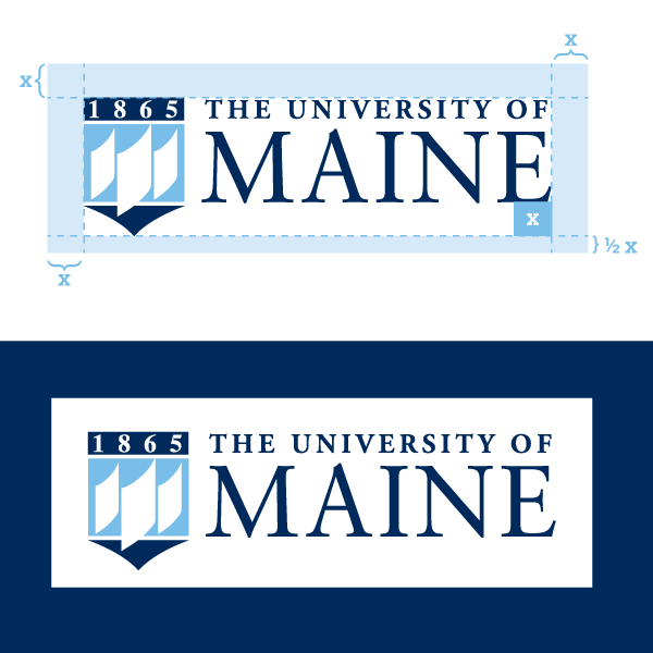
Logo Spacing
When you’re using the UMaine logo, make sure you give the logo room. The empty space around the logo should be measured by “x” (the distance between the bottom of the “E” and the bottom of the crest).
What Not To Do
Logo on a Light Background
Do not use the reverse primary logo on a background that is too light. In this instance, the primary logo should be used.

Logo on a Dark Background
Do not use the primary logo on a background that is too dark. In this instance, the reverse primary logo should be used.
Reverse Logo
Do not use the incorrect reverse logo. In this instance, the white primary logo should be used.
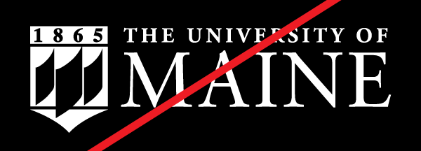
No Outline
Do not use the full crest logo on a dark background without the outline crest. In this instance, the reverse primary logo should be used.
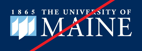
Altering the Logo Colors
Do not change the logo colors for any reason.

Stretching the Logo
Do not stretch the logo vertically or horizontally in any way. When in your design program, hold the shift key on your keyboard to maintain the proportions of the logo.
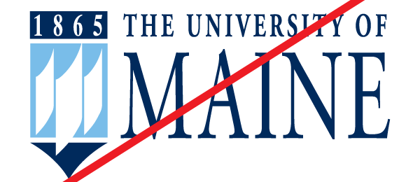

Wrong Crest
Do not use the Maine crest with the wordmark. The Maine crest should only be used as a standalone logo when the wordmark is not used. In this instance, either the primary logo or the Maine crest logo (not both) should be used.

Wrong Standalone Crest
Do not use the 1865 crest without the University of Maine wordmark. If you wish to use the crest as a standalone mark, use the crest logo with MAINE in place of 1865. In this instance, the Maine crest logo should be used.

Adjusting Crest Size
Do not adjust the size of the crest in comparison to the wordmark. If you need to reduce the size, the entire logo should be reduced.
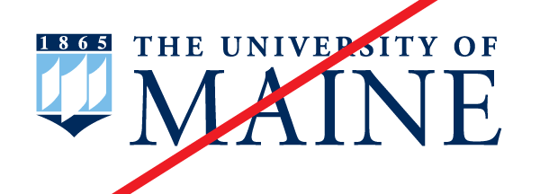
Crest and Wordmark Spacing
Do not alter the spacing between the crest and the wordmark.

Pulling the Logo Apart
Do not alter the spacing between the crest and the wordmark.
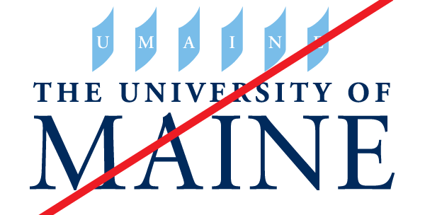
Altering the Crest
Do not alter the crest in any way by removing elements of the logo and replacing them with your own.

Change the Logo Text
Do not change the logo text in any way. In this instance, the primary logo should be used.
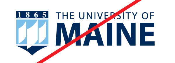
Unnecessary Logo Effects
Do not add unnecessary effects to the logo such as drop shadows, bevel, emboss, etc. The logo should be presented in a clear way.
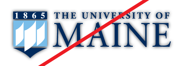
Stacking the Logo
Do not add unnecessary effects to the logo such as drop shadows, bevel, emboss, etc. The logo should be presented in a clear way.
